python開發如何繪製柱狀圖
一不小心又失業了閒著沒事,做了一下北京的iOS開發從業者的資料分析(此資料僅供個人學習使用)
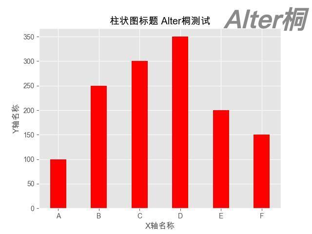
首先看看用python如何繪製的柱狀圖
首先開啟pycharm 命令安裝
pip3 install matplotlib
然後匯入標頭檔案原始碼展示 當然了我這裡都是展示的邏輯
```
-- coding: utf-8 --
import matplotlib.pyplot as plt
plt.rcParams['font.sans-serif'] = ['Arial Unicode MS'] plt.rcParams['axes.unicode_minus'] = False # 正常顯示負號
X = ['A', 'B', 'C', 'D', 'E', 'F'] #X軸資料 Y = [100, 250, 300, 350, 200, 150] #Y軸資料
plt.style.use('ggplot') #新增網格線 plt.title("柱狀圖示題") #柱狀圖示題 plt.xlabel("X軸名稱") #X軸名稱 plt.ylabel("Y軸名稱") #Y軸名稱
plt.bar(X, Y, 0.4, color="red") #繪製柱狀圖
plt.savefig('柱狀圖1.jpg') # 儲存到本地資料夾,當前路徑下 plt.show() # 顯示柱狀圖
這裡有個小問題如果用的是mac電腦中文會顯示亂碼 那應該如何處理呢。
首先匯入matplotlib 在去列印地址
import matplotlib
print(matplotlib.matplotlib_fname())
```
拿到列印地址 command + g 進入
然後編輯檔案matplotlibrc
可以直接在最下面加上三行
font.family: sans-serif
font.sans-serif: Arial Unicode MS, Bitstream Vera Sans, Lucida Grande, Verdana, Geneva, Lucid, Arial, Helvetica, Avant Garde, sans-serif
axes.unicode_minus: False
然後把~/.matplotlib目錄下的兩個檔案刪除掉(快取檔案可以放心刪): rm -rf ~/.matplotlib/*
重啟python
即可解決中文無法正常解決的問題。
這些問題都處理完了這裡我處理了資料並且展示了 3月份北京iOS的 找工作的年齡區間先上處理完的資料 再上程式碼 (此資料僅供個人學習使用)
```
import matplotlib.pyplot as plt
plt.rcParams['font.sans-serif'] = ['Arial Unicode MS']
plt.rcParams['axes.unicode_minus'] = False # 正常顯示負號
準備資料
age20 = manager.age20 / manager.allWorkState age2025 = manager.age2025 / manager.allWorkState age2530 = manager.age2530 / manager.allWorkState age3035 = manager.age3035 / manager.allWorkState age3540 = manager.age3540 / manager.allWorkState age40 = manager.age40 / manager.allWorkState
Yage20 = (round(age20 * 100, 2)) Yage2025 = (round(age2025 * 100, 2)) Yage2530 = (round(age2530 * 100, 2)) Yage3035 = (round(age3035 * 100, 2)) Yage3540 = (round(age3540 * 100, 2)) Yage40 = (round(age40 * 100, 2))
X = ['小於20', '20-25', '25-30', '30-35', '35-40', '40以上'] # X軸資料 Y = [Yage20, Yage2025, Yage2530, Yage3035, Yage3540, Yage40] # Y軸資料
plt.style.use('ggplot') # 新增網格線 plt.title("iOS開發23年3月統計年齡統計") # 柱狀圖示題 plt.xlabel("目前工作年齡 僅做個人開發學習分析") # X軸名稱 plt.ylabel("人數百分比統計") # Y軸名稱
bar = plt.bar(X, Y, 0.4, color="red") # 繪製柱狀圖 plt.bar_label(bar, fmt='%g%%')
plt.savefig('工作年齡.jpg') # 儲存到本地資料夾,當前路徑下 plt.show() # 顯示柱狀圖 ``` 結束了,喜歡我的文章別忘點贊。 另外我還統計了薪資區間 工作的在職離職狀態有需要的可以私信我哈